

Nintendo recently unveiled its innovative Alarmo clock, a device that combines playful design with practical features like a motion sensor. Priced at $100, the Alarmo has captured attention, but alongside its launch, Nintendo shared intriguing insights into the early prototypes that shaped its development. This look back reveals how the project evolved and the thought processes behind its design choices.
The Initial Concepts
During an “Ask the Developer” session, Nintendo’s team shared details about the original prototypes of the Alarmo. One of the earliest designs showcased a more traditional, boxy shape in a neutral gray color. While this prototype incorporated a dot matrix LED display reminiscent of the now-defunct Echo Dot with Clock, it ultimately fell short of the team’s vision. Yosuke Tamori, who led the development of the Alarmo, explained that the team felt this display system would not effectively communicate the product’s features, particularly its new motion sensor capabilities.
Tamori emphasized that clarity was paramount. The prototype’s design did not adequately convey the functionality and benefits of the motion sensor, which was a significant selling point. The team recognized that an intuitive design was essential to ensure users could easily understand and utilize the clock’s features without confusion.
Refining the Design
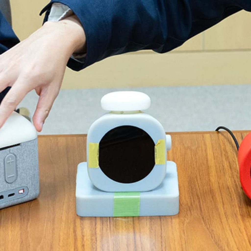
The second prototype was a closer reflection of the Alarmo that consumers can purchase today. This iteration featured a more recognizable shape, designed with a base that housed the clock’s internal components, while the upper section included the LCD screen and speaker. It had two dials for setting the time and alarms—one on the top and another on the side. However, feedback from users highlighted usability issues, particularly for left-handed individuals. The right-side dial proved cumbersome for those who preferred using their left hand, leading the design team to rethink the control layout.
As a result, the team made the decision to centralize all controls on the top of the Alarmo, enhancing accessibility for all users. This design change reflected a deeper understanding of user ergonomics and the need for a versatile device that could be easily operated by anyone.
The Importance of Familiarity
One of the key discussions within the design team revolved around the visual identity of the Alarmo. Tetsuya Akama, the director of the Alarmo project, noted that the decision-making process included weighing the benefits of a novel design against the need for familiarity. While the Alarmo introduces unique features that set it apart from traditional alarm clocks, the team recognized the importance of retaining elements that users would instantly identify as an alarm clock.
This insight guided the team to favor a design that would resonate with consumers, leveraging familiar shapes and aesthetics. The goal was to ensure that even as a new product, the Alarmo would be instantly recognizable, reducing the learning curve for new users.
Color and Aesthetic Choices
An interesting aspect of the Alarmo’s design is its vibrant red color. This choice was deliberate, intended to make the clock stand out in a market often filled with muted colors. The bright hue not only enhances the device’s playful appeal but also serves a functional purpose—making the Alarmo easy to locate in a dimly lit room, a common scenario for an alarm clock.
The color choice aligns with Nintendo’s broader branding strategy, which frequently employs bold, eye-catching colors in its products. This attention to detail reflects the company’s commitment to creating not just functional devices but also visually appealing ones that resonate with its audience.
The Role of User Experience
Nintendo’s development team carefully considered user experience throughout the design process. The decision to omit gesture controls, for example, stemmed from concerns about reliability and ease of use. While gesture controls could have added a layer of modernity to the product, the team opted for a more straightforward approach, prioritizing functionality and ensuring that users would have a seamless interaction with the Alarmo.
This decision highlights Nintendo’s focus on creating products that prioritize usability over the latest trends. The team recognized that while innovative features can be appealing, they must not come at the cost of practicality.
The Balance of Playfulness and Functionality
The Alarmo clock embodies a balance of playful design and practical functionality, a hallmark of Nintendo’s approach to product development. The team understood that, while it is an alarm clock, it could also be an engaging addition to a user’s daily routine. The playful elements incorporated into the design reflect Nintendo’s ethos of making technology accessible and enjoyable.
By creating a product that feels both familiar and fresh, Nintendo aims to attract a wide range of users—from those seeking a straightforward alarm clock to fans of the brand looking for a unique piece of tech.
Conclusion
The development of Nintendo’s Alarmo clock is a fascinating journey through design iterations and user-centered thinking. The transition from boxy prototypes to a sleek, recognizable alarm clock illustrates the careful consideration given to user experience, functionality, and aesthetic appeal. By sharing these insights, Nintendo not only showcases its innovative spirit but also emphasizes the importance of understanding user needs and market expectations.
As consumers embrace the Alarmo, they do so with an understanding of the thought and creativity that went into its creation. This device is not just an alarm clock; it’s a reflection of Nintendo’s commitment to merging playful design with practical technology, making it a delightful addition to any bedroom.